Introduction
The Rose Pine Theme for R is a custom ggplot2 theme
inspired by the Rose Pine Theme from Python, designed to provide a calm,
modern aesthetic for your visualizations. The theme incorporates the
signature colors and styling of the Rose Pine color palette while adding
improvements and customizations for use in R-based data visualizations.
This theme is perfect for creating plots with a soothing, minimalist design that is easy on the eyes, while maintaining a professional look for your data visualizations.
Credits: Inspired by the Python-based (Rose Pine Theme).
Project Repository
You can access the Rose Pine Theme for R project repository on GitHub here:
Rose Pine Theme for R
(https://github.com/msjahid/rosepine-theme).
Feel free to explore, contribute, or fork the repository!
Installation
-
Install Dependencies:
Ensure you have the
ggplot2package installed, as this theme is based on it.install.packages("ggplot2")- Install the Rose Pine Theme for R:
You can download the theme directly from the GitHub repository. If you don't have the
devtoolspackage installed, you can install it first:install.packages("devtools")Then, use
devtoolsto install the Rose Pine Theme for R from the GitHub repository:devtools::install_github("msjahid/rosepine-theme")Create an Issue
If you encounter any bugs, have suggestions, or want to request new features,
please feel free to open an issue on the project's GitHub repository.
Your feedback is greatly appreciated!
To create an issue, visit the following link: [Rose Pine Theme for R - GitHub Issues]Usage
After installing the Rose Pine Theme for R, you can easily apply it to your
ggplot2plots. Here's how to use the theme in your R code.Basic Example
                    library(ggplot2)
                    library(rosepineTheme)

                    # Test Dataset
                    set.seed(42)
                    test_data <- data.frame(
                      x = rnorm(100),
                      y = rnorm(100),
                      group = sample(letters[1:3], 100, replace = TRUE)
                    )

                    # Create a sample data frame
                    set.seed(42)  # For reproducibility

                    # Sample data with gender, depression score, and volunteer status
                    city_gender_rev <- data.frame(
                      sex = rep(c("female", "male"), times = 50),        # Gender (sex) column
                      depression = c(rnorm(50, mean = 20, sd = 5), rnorm(50, mean = 18, sd = 6)),  # Depression scores
                      volunteer = sample(c("yes", "no"), 100, replace = TRUE)  # Volunteer status
                    )

                    # 1. Scatter Plot
                    scatter_plot <- ggplot(test_data, aes(x = x, y = y, color = group)) +
                      geom_point(size = 3) +
                      labs(title = "Scatter Plot", x = "X-axis", y = "Y-axis") +
                      theme_rose_pine() +
                      scale_color_rose_pine()

                    # 2. Bar Plot
                    bar_plot <- ggplot(test_data, aes(x = group, fill = group)) +
                      geom_bar() +
                      labs(title = "Bar Plot", x = "Group", y = "Count") +
                      theme_rose_pine() +
                      scale_fill_rose_pine()

                    # 3. Line Plot
                    line_plot <- ggplot(test_data, aes(x = x, y = y, color = group)) +
                      geom_line() +
                      labs(title = "Line Plot", x = "X-axis", y = "Y-axis") +
                      theme_rose_pine() +
                      scale_color_rose_pine()

                    # 4. Histogram
                    histogram_plot <- ggplot(test_data, aes(x = x, fill = group)) +
                      geom_histogram(binwidth = 0.5, position = "dodge") +
                      labs(title = "Histogram", x = "X-axis", y = "Frequency") +
                      theme_rose_pine() +
                      scale_fill_rose_pine()

                    # 5. Density Plot
                    density_plot <- ggplot(test_data, aes(x = x, fill = group)) +
                      geom_density(alpha = 0.7) +
                      labs(title = "Density Plot", x = "X-axis", y = "Density") +
                      theme_rose_pine() +
                      scale_fill_rose_pine()

                    # 6. Box Plot
                    # Create a box plot
                    box_plot <- ggplot(city_gender_rev, aes(x = sex, y = depression, fill = volunteer)) +
                      geom_boxplot() +
                      labs(title = "Box Plot",
                           x = "Gender", y = "Depression") +
                      scale_fill_manual(values = c("no" = "#eb6f92", "yes" = "#9ccfd8")) +
                      theme_minimal(base_size = 14) +
                      theme_rose_pine() +
                      scale_color_rose_pine()

                    # 7. Violin Plot
                    # Create a violin plot
                    violin_plot <- ggplot(city_gender_rev, aes(x = sex, y = depression, fill = volunteer)) +
                      geom_violin() +
                      labs(title = "Violin Plot",
                           x = "Gender", y = "Depression") +
                      scale_fill_manual(values = c("no" = "#eb6f92", "yes" = "#9ccfd8")) +
                      theme_minimal(base_size = 14) +
                      theme_rose_pine() +
                      scale_color_rose_pine()

                    # 8. Faceted Scatter Plot
                    faceted_plot <- ggplot(test_data, aes(x = x, y = y, color = group)) +
                      geom_point(size = 2) +
                      facet_wrap(~group) +
                      labs(title = "Faceted Scatter Plot", x = "X-axis", y = "Y-axis") +
                      theme_rose_pine() +
                      scale_color_rose_pine()

                    # 9. Combined Multiple Lines Plot
                    combined_plot <- ggplot(test_data, aes(x = x, y = y, color = group)) +
                      geom_line(size = 1) +
                      geom_point(size = 2) +
                      labs(title = "Combined Line and Scatter Plot", x = "X-axis", y = "Y-axis") +
                      theme_rose_pine() +
                      scale_color_rose_pine()

                    # Display All Plots
                    library(gridExtra)
                    grid.arrange(
                      scatter_plot, bar_plot, line_plot,
                      histogram_plot, density_plot, box_plot,
                      violin_plot, faceted_plot, combined_plot,
                      ncol = 3
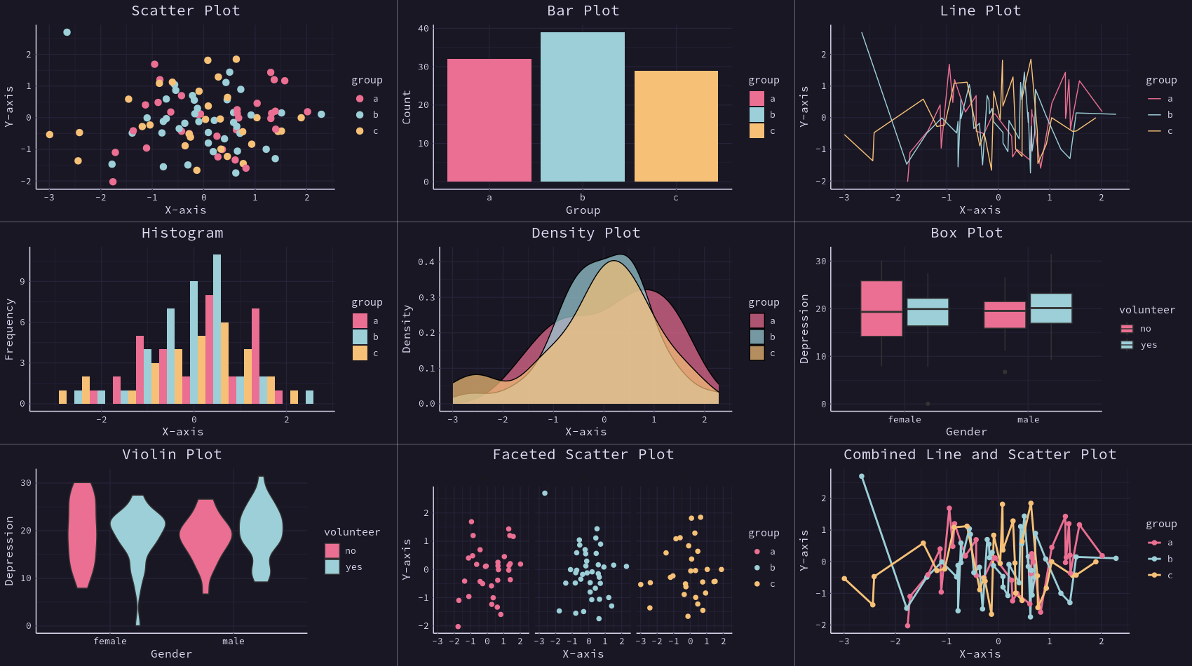
                    )
library(readxl)         # for reading in Excel data
library(dplyr)          # for data manipulation
library(tidyr)          # for data shaping
library(ggplot2)        # for generating the visualizations
library(rosepineTheme)
library(gridExtra)

# Common Theme and Scales
common_theme <- theme_rose_pine()
common_color_scale <- scale_color_rose_pine()
common_fill_scale <- scale_fill_rose_pine()

supermarket <- read_excel("/home/msjahid/Downloads/Supermarket Transactions.xlsx", sheet = "Data")

city_rev <- supermarket %>%
        group_by(City) %>%
        summarise(Revenue = sum(Revenue, na.rm = TRUE)) %>%
        arrange(Revenue) %>%
        mutate(City = factor(City, levels = .$City))

city_gender_rev <- supermarket %>%
        group_by(City, Gender) %>%
        summarise(Revenue = sum(Revenue, na.rm = TRUE)) %>%
        ungroup() %>%
        mutate(City = factor(City, levels = city_rev$City))

# First plot with legend at the top
plot1 <- ggplot(city_gender_rev, aes(City, Revenue, fill = Gender)) +
  geom_bar(stat = "identity") +
  coord_flip() +
  theme_rose_pine() +  # Apply the custom theme
  scale_fill_rose_pine() +  # Apply the fill color scale
  theme(legend.position = "top")  # Move the legend to the top

# Second plot with legend at the top
plot2 <- ggplot(city_gender_rev, aes(City, Revenue, fill = Gender)) +
  geom_bar(stat = "identity", position = "dodge") +
  coord_flip() +
  theme_rose_pine() +  # Apply the custom theme
  scale_fill_rose_pine() +  # Apply the fill color scale
  theme(legend.position = "top")  # Move the legend to the top

# Third plot with legend at the top
plot3 <- ggplot(city_gender_rev, aes(City, Revenue, fill = Gender)) +
  geom_bar(stat = "identity", position = "dodge") +
  coord_flip() +
  facet_wrap(~ Gender) +
  theme_rose_pine() +  # Apply the custom theme
  scale_fill_rose_pine() +  # Apply the fill color scale
  theme(legend.position = "top")  # Move the legend to the top

# Arrange the plots in one row with legends at the top
grid.arrange(plot1, plot2, plot3, ncol = 3)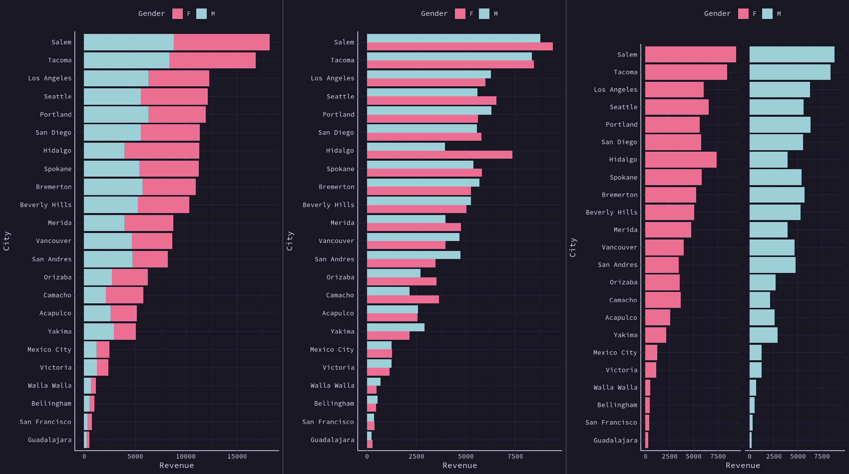
                    library(ggplot2)        # for generating the visualizations
                    library(rosepineTheme)


                    # Create dataset
                    data <- data.frame(
                      individual = paste("Mister ", seq(1, 60), sep = ""),
                      group = factor(c(rep('A', 10), rep('B', 30), rep('C', 14), rep('D', 6))),
                      value1 = sample(seq(10, 100), 60, replace = TRUE),
                      value2 = sample(seq(10, 100), 60, replace = TRUE),
                      value3 = sample(seq(10, 100), 60, replace = TRUE)
                    )

                    # Transform data in a tidy format (long format)
                    data <- data %>% gather(key = "observation", value = "value", -c(1, 2))

                    # Set a number of 'empty bar' to add at the end of each group
                    empty_bar <- 2
                    nObsType <- nlevels(as.factor(data$observation))
                    to_add <- data.frame(matrix(NA, empty_bar * nlevels(data$group) * nObsType, ncol(data)))
                    colnames(to_add) <- colnames(data)
                    to_add$group <- rep(levels(data$group), each = empty_bar * nObsType)
                    data <- rbind(data, to_add)
                    data <- data %>% arrange(group, individual)
                    data$id <- rep(seq(1, nrow(data) / nObsType), each = nObsType)

                    # Get the name and the y position of each label
                    label_data <- data %>%
                      group_by(id, individual) %>%
                      summarise(tot = sum(value), .groups = "drop")  # Add .groups = "drop" to ungroup

                    number_of_bar <- nrow(label_data)
                    angle <- 90 - 360 * (label_data$id - 0.5) / number_of_bar  # Adjust angle calculation

                    label_data$hjust <- ifelse(angle < -90, 1, 0)
                    label_data$angle <- ifelse(angle < -90, angle + 180, angle)

                    # Prepare a data frame for base lines
                    base_data <- data %>%
                      group_by(group) %>%
                      summarize(start = min(id), end = max(id) - empty_bar) %>%
                      rowwise() %>%
                      mutate(title = mean(c(start, end)))

                    # Prepare a data frame for grid (scales)
                    grid_data <- base_data
                    grid_data$end <- grid_data$end[c(nrow(grid_data), 1:nrow(grid_data) - 1)] + 1
                    grid_data$start <- grid_data$start - 1
                    grid_data <- grid_data[-1,]

                    # Create the plot
                    p <- ggplot(data) +
                      geom_bar(aes(x = as.factor(id), y = value, fill = observation), stat = "identity", alpha = 0.5) +
                      geom_segment(data = grid_data, aes(x = end, y = 0, xend = start, yend = 0), colour = "gray", alpha = 1, linewidth = 0.3, inherit.aes = FALSE) +
                      geom_segment(data = grid_data, aes(x = end, y = 50, xend = start, yend = 50), colour = "gray", alpha = 1, linewidth = 0.3, inherit.aes = FALSE) +
                      geom_segment(data = grid_data, aes(x = end, y = 100, xend = start, yend = 100), colour = "gray", alpha = 1, linewidth = 0.3, inherit.aes = FALSE) +
                      geom_segment(data = grid_data, aes(x = end, y = 150, xend = start, yend = 150), colour = "gray", alpha = 1, linewidth = 0.3, inherit.aes = FALSE) +
                      geom_segment(data = grid_data, aes(x = end, y = 200, xend = start, yend = 200), colour = "gray", alpha = 1, linewidth = 0.3, inherit.aes = FALSE) +
                      ggplot2::annotate("text", x = rep(max(data$id), 5), y = c(0, 50, 100, 150, 200), label = c("0", "50", "100", "150", "200"), color = "gray", size = 6, angle = 0, fontface = "bold", hjust = 1) +
                      ylim(-150, max(label_data$tot, na.rm = TRUE)) +
                      theme_rose_pine() +
                      scale_fill_rose_pine() +
                      coord_polar() +
                      geom_text(data = label_data, aes(x = id, y = tot + 10, label = individual, hjust = hjust), color = "white", fontface = "bold", alpha = 0.6, size = 5, angle = label_data$angle, inherit.aes = FALSE) +
                      geom_segment(data = base_data, aes(x = start, y = -5, xend = end, yend = -5), colour = "white", alpha = 0.8, size = 0.6, inherit.aes = FALSE) +
                      geom_text(data = base_data, aes(x = title, y = -18, label = group), hjust = c(1, 1, 0, 0), colour = "white", alpha = 0.8, size = 4, fontface = "bold", inherit.aes = FALSE) +
                      # Remove circle numbers
                      theme(
                        axis.text.x = element_blank(),  # Remove the numbers (1 to 68)
                        axis.ticks.x = element_blank()  # Optionally, remove ticks on the radial axis
                      )

                    # Save at png
                    ggsave("polar_plot.png", plot = p, bg = "#191724", width = 12, height = 9, dpi = 300)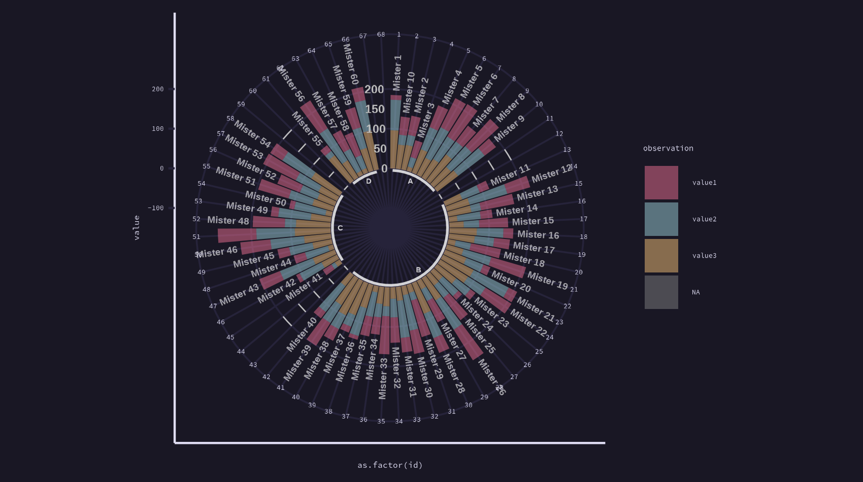
# Required Libraries
library(ggplot2)
library(dplyr)
library(tidyr)
library(rosepineTheme)
library(gridExtra)

# Create dataset (assuming probability values for each category)
set.seed(42) # For reproducibility
data1 <- data.frame(
  category = rep(c("Almost Certainly", "Very Good Chance", "We Believe",
                   "Likely", "About Even", "Little Chance",
                   "Chances Are Slight", "Almost No Chance"), each = 100),
  probability = c(rbeta(100, 2, 5) * 100,
                 rbeta(100, 2, 3) * 100,
                 rbeta(100, 3, 3) * 100,
                 rbeta(100, 3, 5) * 100,
                 rbeta(100, 4, 5) * 100,
                 rbeta(100, 1, 5) * 100,
                 rbeta(100, 1, 2) * 100,
                 rbeta(100, 1, 10) * 100)
)

# Create the dataset (command names and their popularity counts)
data2 <- data.frame(
  command = c("dumpy", "background", "help", "text", "tall", "ping", "eject",
              "votes", "invite", "literallynobot", "statcord", "shards", "support"),
  popularity = c(244697, 34850, 29797, 18775, 14253, 9500, 7200, 5400,
                 3600, 1985, 1100, 750, 540)
)

# Plot 1 - Violin Plot
plot1 <- ggplot(data1, aes(x = probability, y = category, fill = category)) +
  geom_violin(trim = FALSE) +
  theme_rose_pine() +  # Apply the Rosé Pine theme
  theme(
    axis.title.x = element_text(size = 12, color = "white"),
    axis.title.y = element_text(size = 12, color = "white"),
    axis.text.x = element_text(size = 10, color = "white"),
    axis.text.y = element_text(size = 10, color = "white"),
    panel.grid.major = element_line(color = "gray", size = 0.5),
    plot.title = element_text(size = 16, color = "white", face = "bold", hjust = 0.5)
  ) +
  labs(
    title = "Assigned Probability",
    x = "Assigned Probability (%)",
    y = "Categories"
  ) +
  theme(legend.position = "none")  # Remove legend, if not required

# Create a plot with dynamic colors
plot2 <- ggplot(data2, aes(x = reorder(command, -popularity), y = popularity, fill = command)) +
  geom_bar(stat = "identity") +
  coord_flip() +  # Flip the coordinates for horizontal bars
  ggtitle("Total Command Popularity") +
  xlab("Name of command") +
  ylab("# of times used") +
  theme_rose_pine() +  # Apply the Rosé Pine theme
  scale_fill_rose_pine() +  # Apply dynamic color palette
  theme(
    axis.text.x = element_text(color = "white"),
    axis.text.y = element_text(color = "white"),
    plot.title = element_text(color = "white", size = 16, face = "bold"),
    axis.title = element_text(color = "white"),
    panel.grid = element_line(color = "grey30"),
    legend.position = "none"  # Remove legend
  )

# Display All Plots in a Single Row
grid.arrange(plot1, plot2, ncol = 2)  # Set ncol = 2 for side-by-side display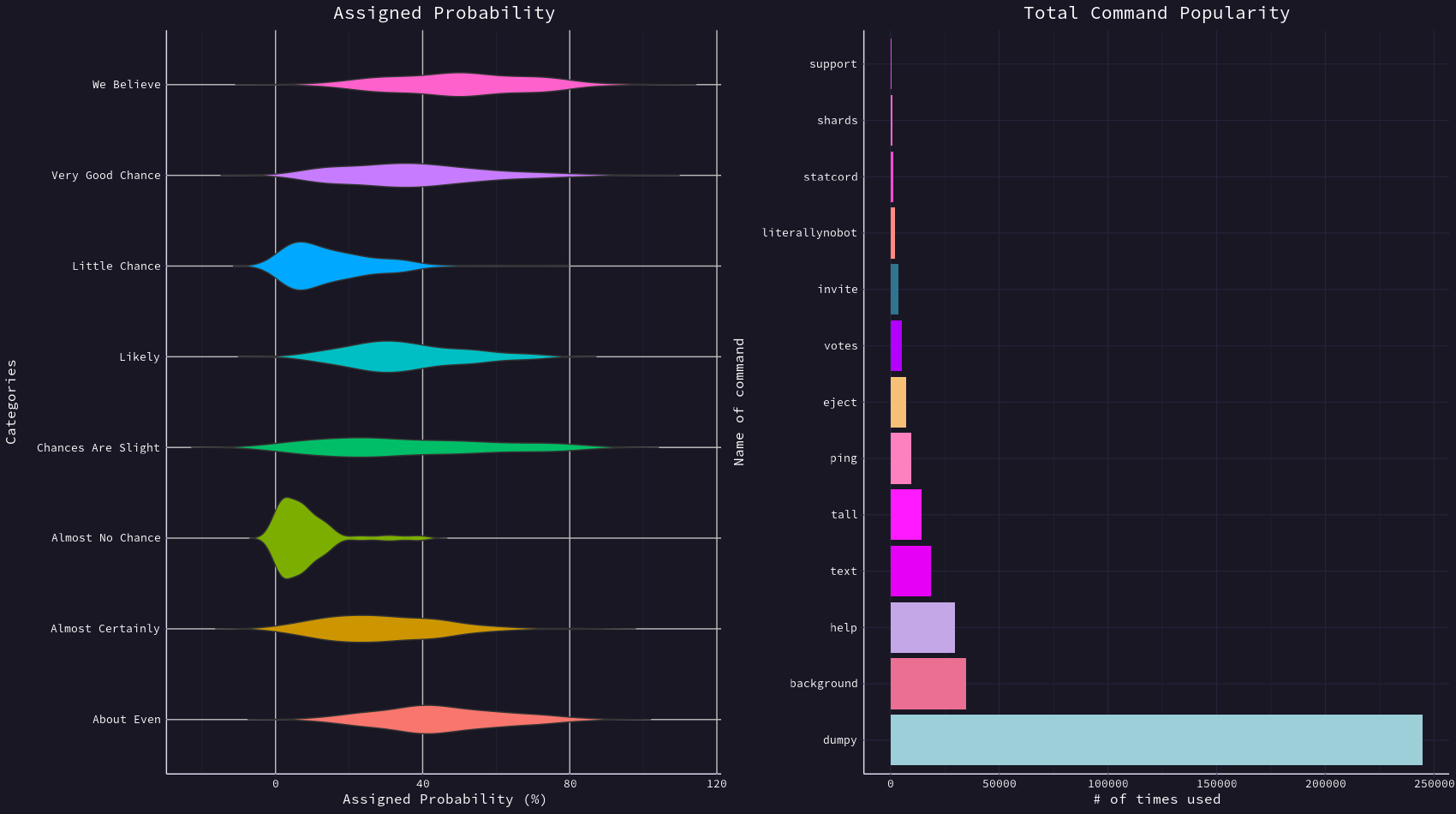
                    # Required Libraries
                    library(ganttrify)
                    library(ggplot2)        # for generating the visualizations
                    library(rosepineTheme)  # Assuming you've already defined this theme
                    library(readxl)         # for reading in Excel data
                    library(dplyr)          # for data manipulation
                    library(tidyr)          # for data shaping
                    library(gridExtra)

                    # Common Theme and Scales
                    common_theme <- theme_rose_pine()
                    common_color_scale <- scale_color_rose_pine()
                    common_fill_scale <- scale_fill_rose_pine()

                    supermarket <- read_excel("/home/msjahid/Downloads/Supermarket Transactions.xlsx", sheet = "Data")

                    city_rev <- supermarket %>%
                            group_by(City) %>%
                            summarise(Revenue = sum(Revenue, na.rm = TRUE)) %>%
                            arrange(Revenue) %>%
                            mutate(City = factor(City, levels = .$City))

                    city_gender_rev <- supermarket %>%
                            group_by(City, Gender) %>%
                            summarise(Revenue = sum(Revenue, na.rm = TRUE)) %>%
                            ungroup() %>%
                            mutate(City = factor(City, levels = city_rev$City))

                    big_diff <- city_gender_rev %>%
                            spread(Gender, Revenue) %>%
                            group_by(City) %>%
                            mutate(Max = max(F, M),
                                   Min = min(F, M),
                                   Diff = Max / Min - 1) %>%
                            arrange(desc(Diff)) %>%
                            filter(Diff > .2)

                    highlight <- filter(city_gender_rev, City %in% big_diff$City)

                    # create a new label data frame
                    right_label <- city_gender_rev %>%
                            group_by(City) %>%
                            arrange(desc(Revenue)) %>%
                            top_n(1)
                    plot_label <- big_diff %>%
                            select(City, Revenue = Max, Diff) %>%
                            right_join(right_label)

                    # Create Gantt chart and apply Rosé Pine theme
                    plot1 <- ganttrify(
                      project = ganttrify::test_project,
                      spots = ganttrify::test_spots,
                      project_start_date = "2021-04",
                      spot_size_text_relative = 1.5,
                      spot_fill = ggplot2::alpha(c("white"), 0.7),
                      spot_padding = ggplot2::unit(0.4, "lines")
                    ) +
                      theme_rose_pine() +  # Apply the Rosé Pine theme
                       theme(
                        legend.position = "none"  # Remove the legend completely
                      )

                    plot2 <- ggplot(city_gender_rev, aes(Revenue, City)) +
                            geom_line(aes(group = City), alpha = .3) +
                            geom_point(aes(color = Gender), size = 1.5, alpha = .3) +
                            labs(title = "Total Revenue by City and Gender",
                                 subtitle = "Out of 23 cities, eight locations experience a 20% or greater difference \nin revenue generated by males versus females. Hidalgo experiences the \ngreatest difference with females generating 86% more revenue than males.") +
                            geom_line(data = highlight, aes(group = City)) +
                            geom_point(data = highlight, aes(color = Gender), size = 2) +
                            geom_text(data = plot_label, aes(color = Gender,
                                                             label = paste0("+", scales::percent(round(Diff, 2)))),
                                      size = 3, hjust = -.5)+
                            theme_rose_pine() +
                            scale_color_rose_pine() +
                            scale_fill_rose_pine() +
                            theme(axis.title = element_blank(),
                            plot.title = element_text(size = 20, margin = margin(b = 10)),
                            plot.caption = element_text(size = 8, margin = margin(t = 10), color = "grey70", hjust = 0))

                    # Display All Plots in a Single Row
                    grid.arrange(plot1, plot2, ncol = 2)  # Set ncol = 2 for side-by-side display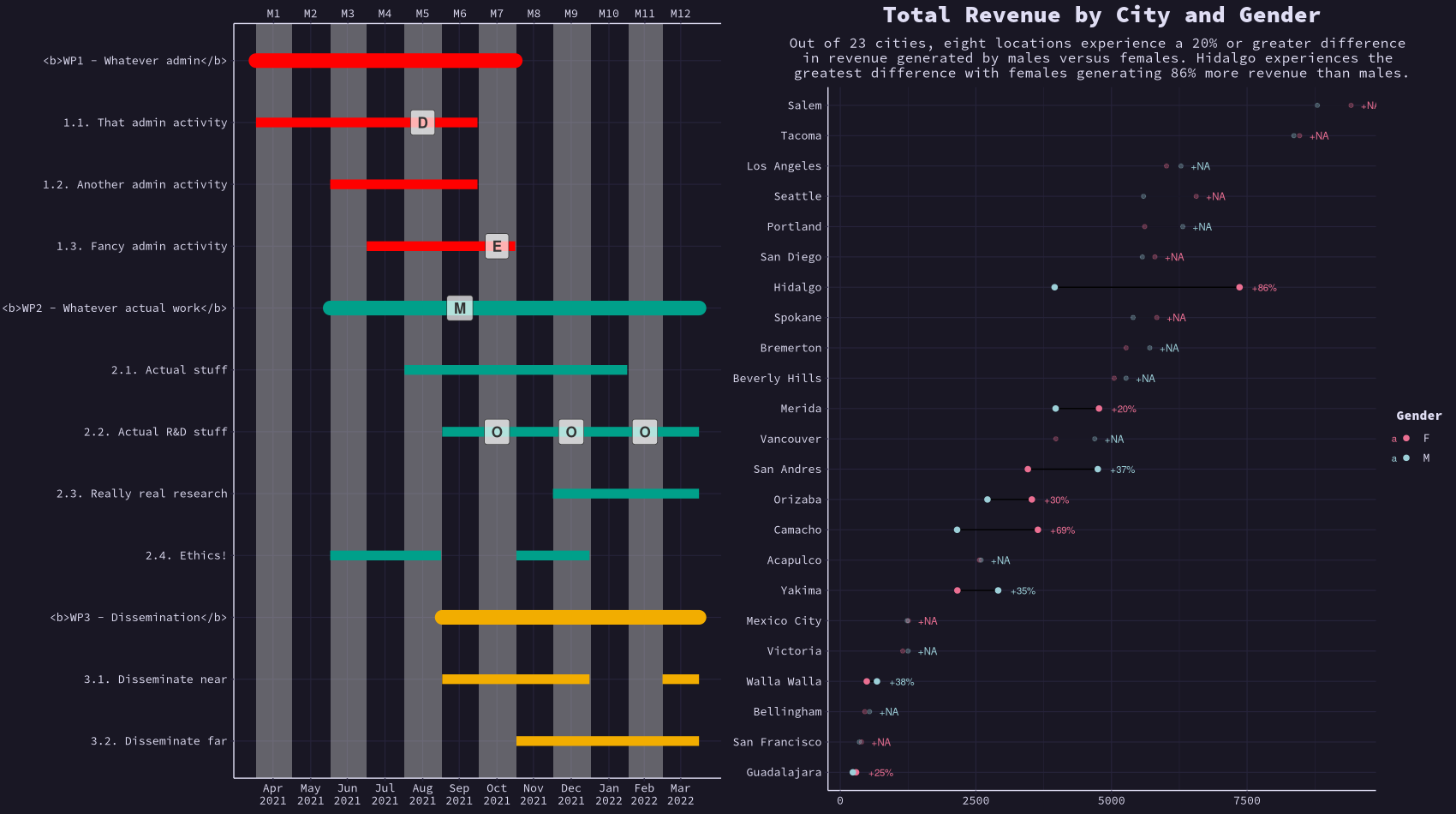
                    # Required Libraries
                    library(ggplot2)
                    library(reshape2)
                    library(RColorBrewer)
                    library(rosepineTheme)

                    # Calculate Correlation Matrix
                    M <- cor(mtcars)
                    data(mpg, package="ggplot2")

                    # Melt the correlation matrix to long format
                    M_melted <- melt(M)

                    # Create a ggplot-based correlation matrix plot with Rosé Pine theme
                    plot1 <- ggplot(M_melted, aes(Var1, Var2, fill = value)) +
                      geom_tile() + # Tile for the correlation values
                      geom_text(aes(label = round(value, 2)), color = "white", size = 4) + # Add correlation coefficients on tiles
                      scale_fill_gradient2(low = rose_pine_colors$accent1, high = rose_pine_colors$accent2, mid = rose_pine_colors$accent3, midpoint = 0) + # Color scale
                      theme_rose_pine(base_size = 12) + # Apply the Rosé Pine theme
                      theme(
                        axis.text.x = element_text(angle = 45, hjust = 1), # Rotate x-axis labels
                        axis.text.y = element_text(size = 10), # Y-axis text size
                        axis.title = element_blank(), # Remove axis titles
                        panel.grid = element_blank() # Remove grid lines
                      ) +
                      ggtitle("Correlation Matrix") # Add plot title

                    mpg_select <- mpg[mpg$manufacturer %in% c("audi", "ford", "honda", "hyundai"), ]

                    plot2 <- ggplot(mpg_select, aes(displ, cty)) +
                      labs(subtitle="mpg: Displacement vs City Mileage",
                           title="Bubble chart") +
                      theme_rose_pine() +
                      scale_color_rose_pine() +
                      scale_fill_rose_pine() +
                      geom_jitter(aes(col=manufacturer, size=hwy), shape = 21, fill = "#31748f") +
                      geom_smooth(aes(col=manufacturer), method="lm", se=F)

                    # Display All Plots in a Single Row
                    grid.arrange(plot1, plot2, ncol = 2)  # Set ncol = 2 for side-by-side display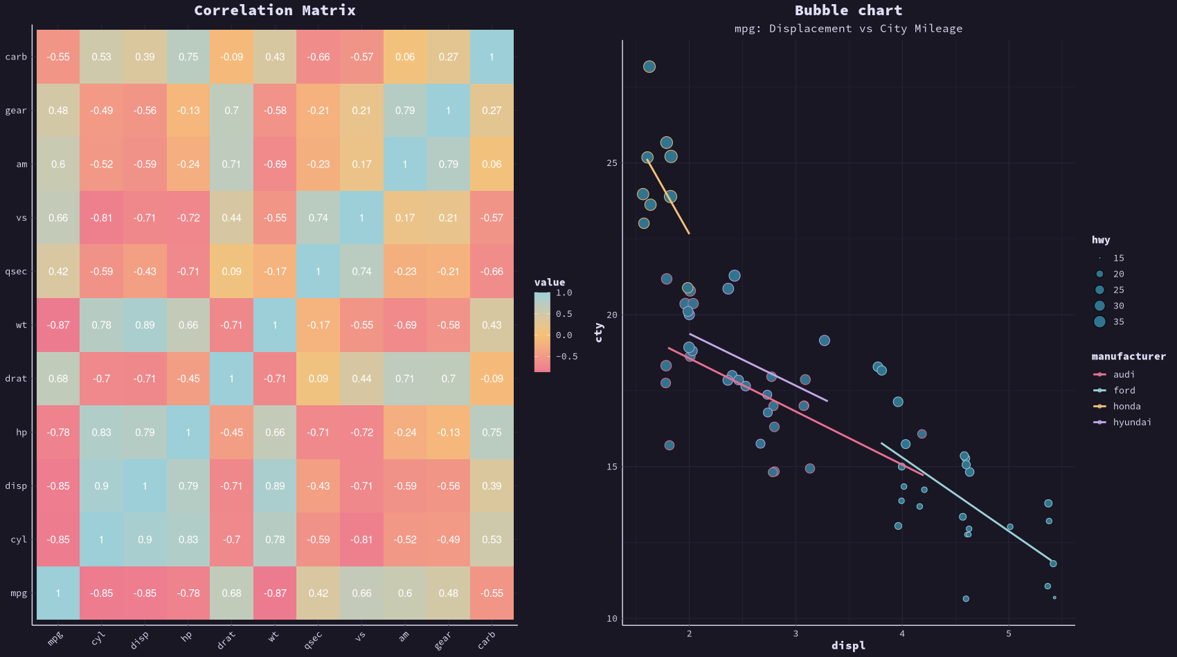
                    library(ggplot2)
                    library(rosepineTheme)
                    library(data.table)
                    library(maps)

                    # Set seed for reproducibility
                    set.seed(1)

                    # Prepare the map data for counties
                    map.county <- map_data('county')
                    counties   <- unique(map.county[,5:6])

                    # Create the obesity_map with random data
                    obesity_map <- data.frame(state_names = counties$region,
                                              county_names = counties$subregion,
                                              obesity = runif(nrow(counties), min = 0, max = 100))

                    # Use data.table for faster merging
                    map.county <- data.table(map_data('county'))
                    setkey(map.county, region, subregion)

                    obesity_map <- data.table(obesity_map)
                    setkey(obesity_map, state_names, county_names)

                    # Merge the data
                    map.df <- map.county[obesity_map]

                    # Create the plot with Rosé Pine theme
                    map <- ggplot(map.df, aes(x = long, y = lat, group = group, fill = obesity)) +
                      geom_polygon() +
                      coord_map() +
                      theme_rose_pine() +  # Apply Rosé Pine theme
                      labs(title = "Obesity Map",
                           fill = "Obesity %")  # Adding title and fill legend label

                    # Save at png
                    ggsave("map.png", plot = map, bg = "#191724", width = 12, height = 9, dpi = 300)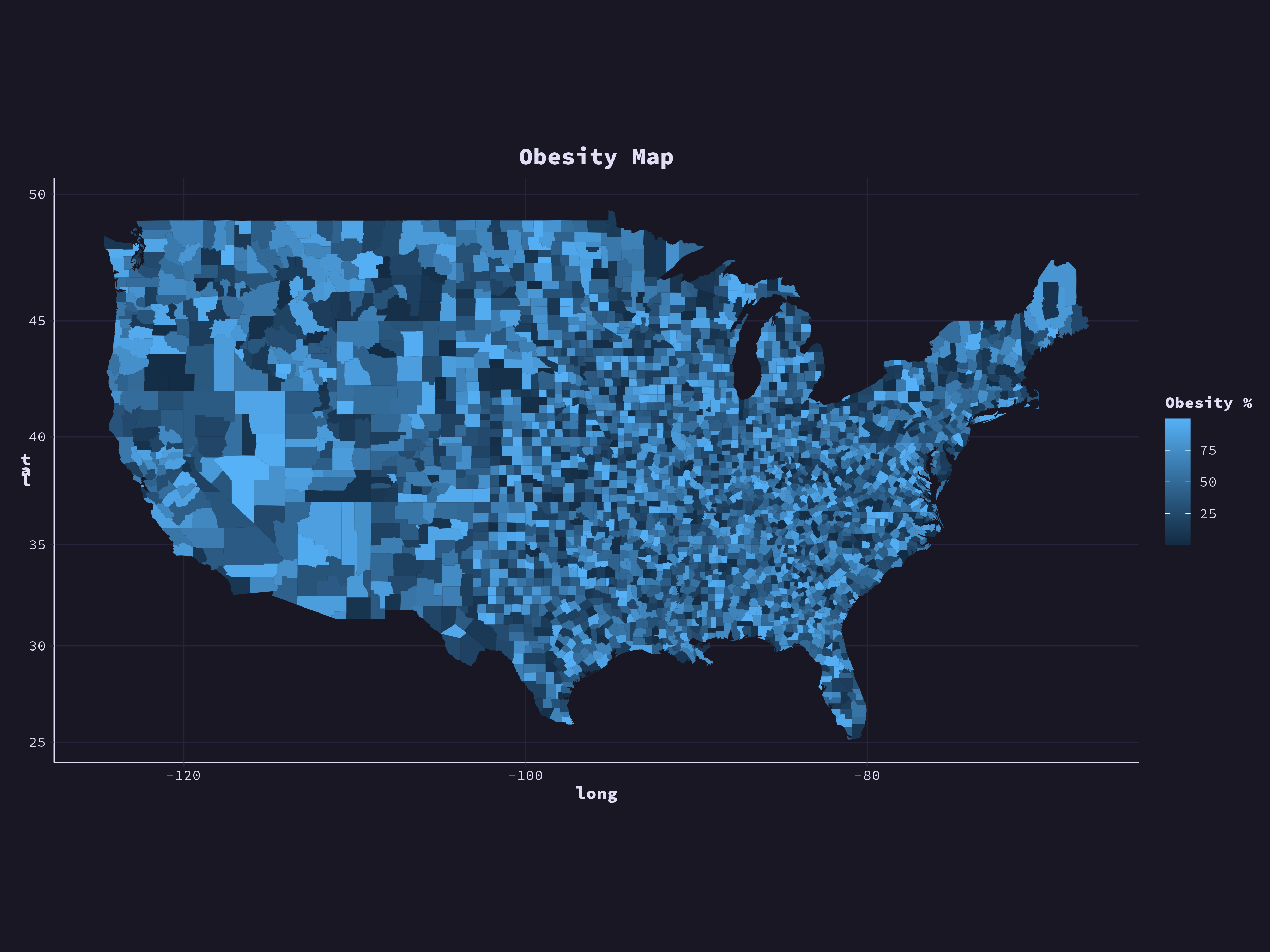
- Install the Rose Pine Theme for R: